
35 (sango)
Branding / Art Direction / Graphic Design
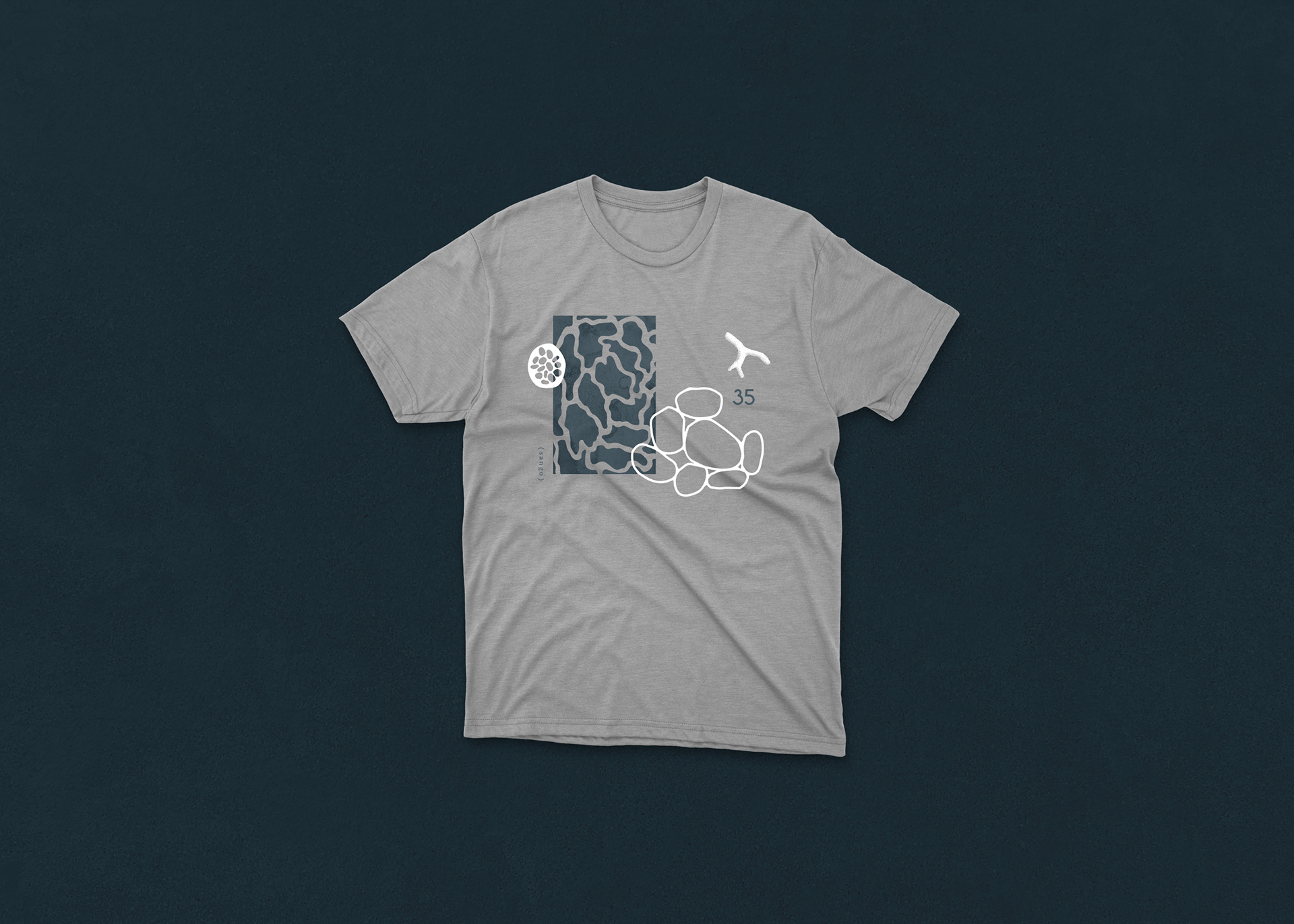
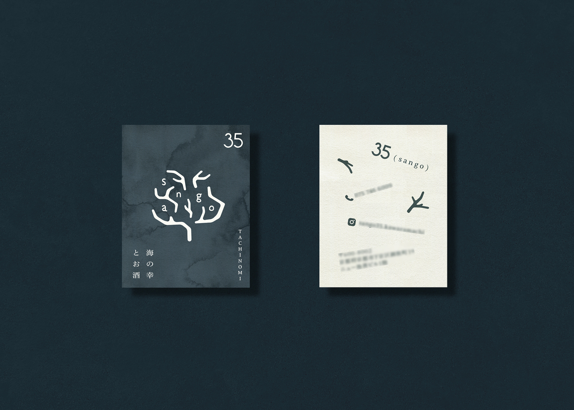
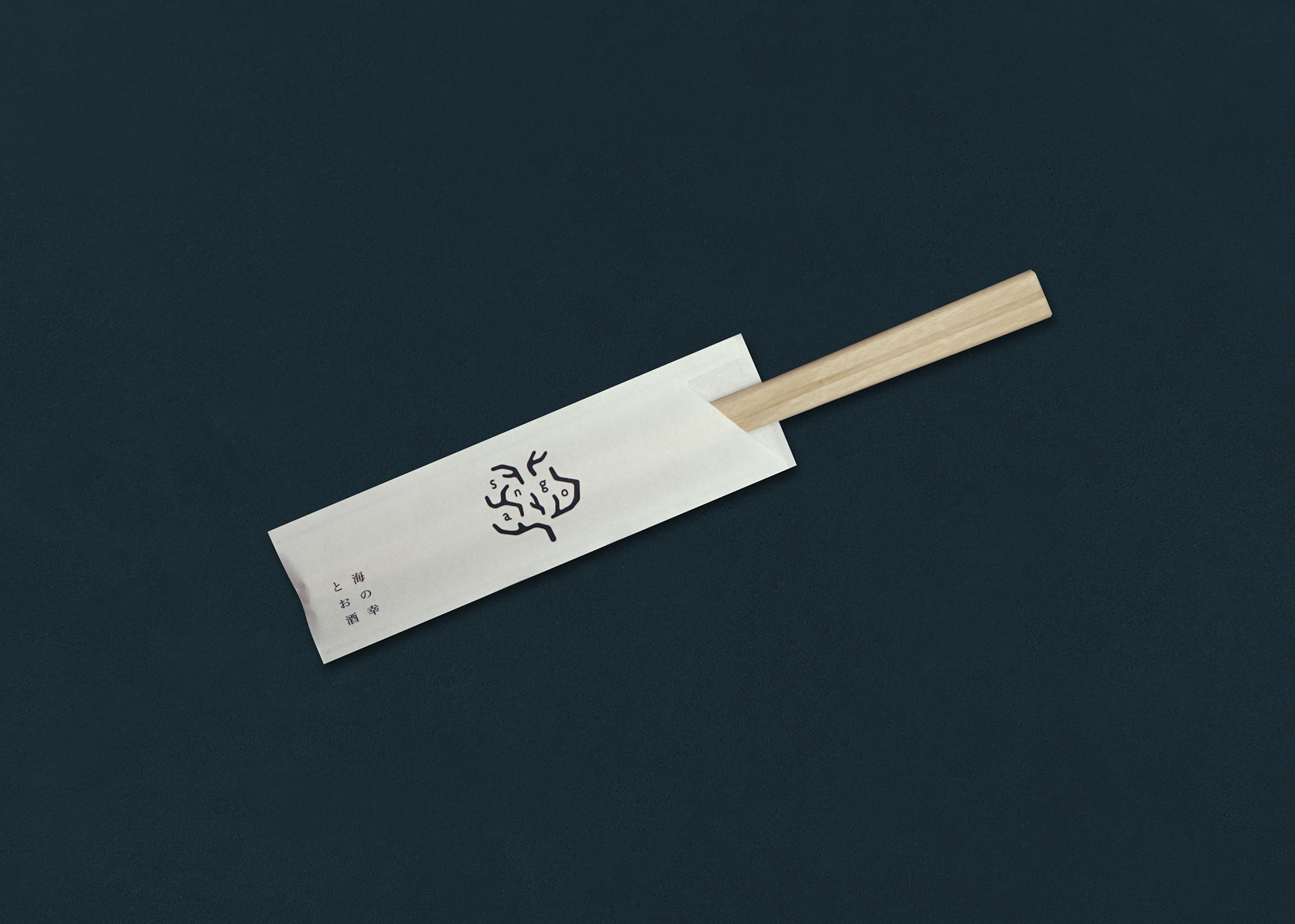
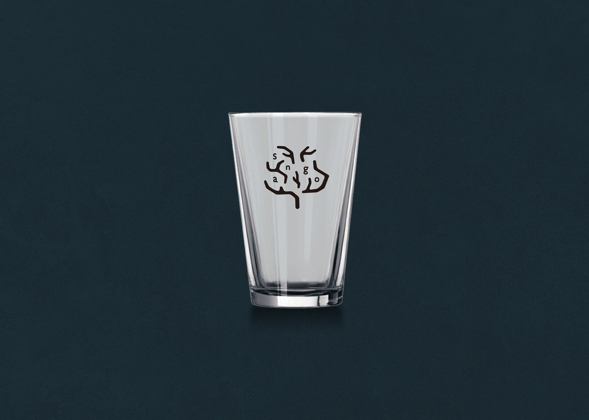
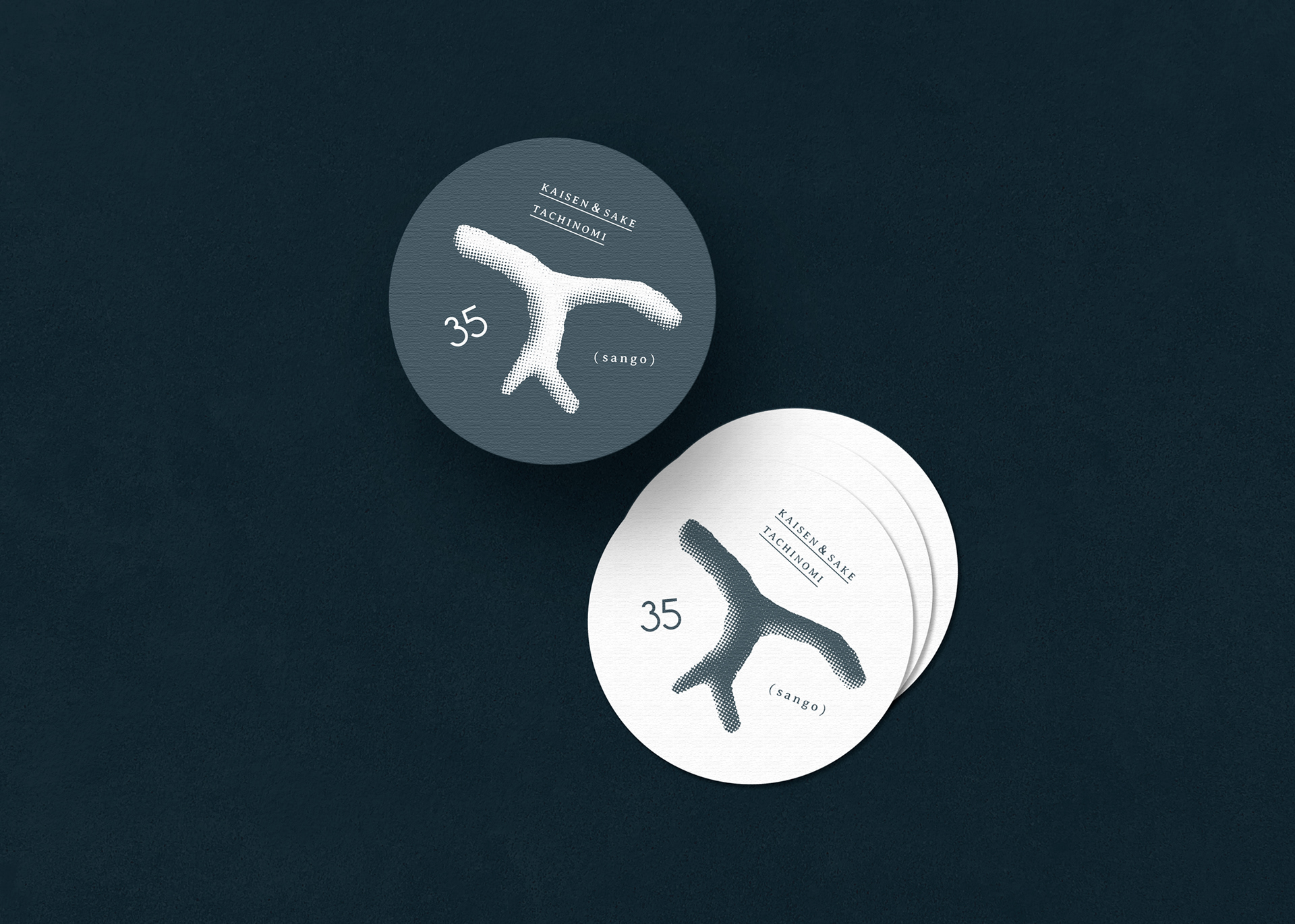
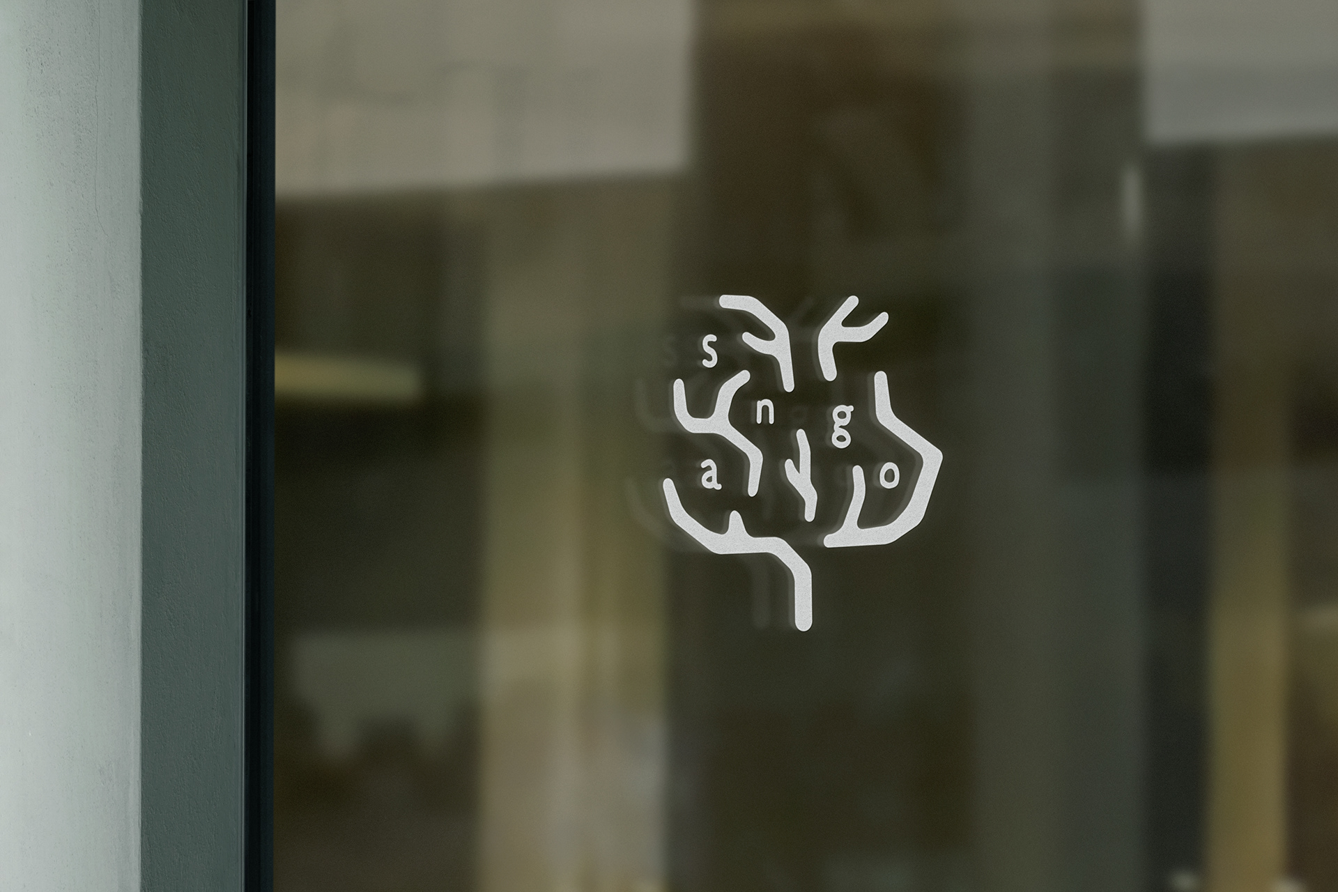
Naming, Logo, Key Visual, Uniform, Shopcard, Coaster, Chopstick Bag
京都の河原町駅付近にオープンする海鮮立ち飲みのブランディングを担当しました。(現在閉鎖中)
お店の立地は、駅の狭い路地のような場所にあって隠れ家的な存在です。
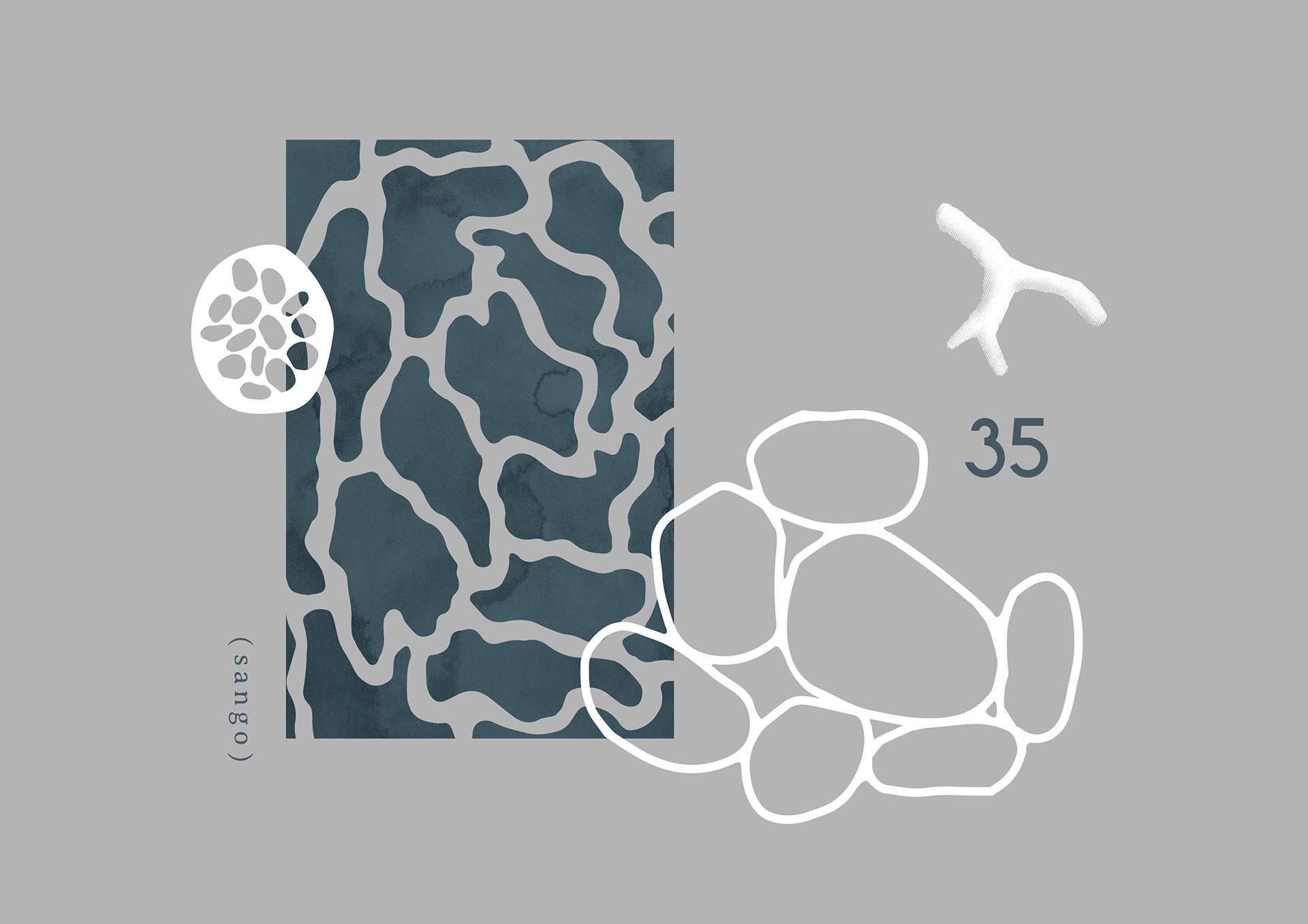
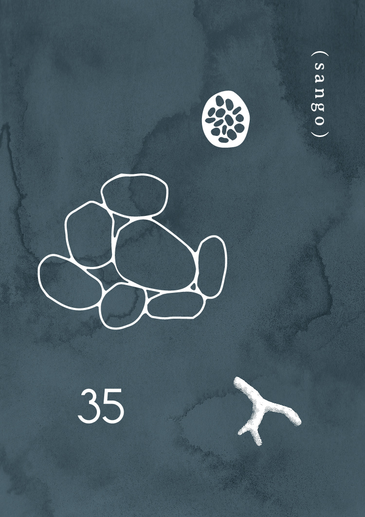
海の中でクマノミは珊瑚を隠れ家にしますが、京都を1つの海に例えた場合、お店の存在がそういった珊瑚の存在に似ているところから35(sango)というネーミングにしました。また、ロゴデザインの珊瑚は35に見えるような形になっています。
お店の立地は、駅の狭い路地のような場所にあって隠れ家的な存在です。
海の中でクマノミは珊瑚を隠れ家にしますが、京都を1つの海に例えた場合、お店の存在がそういった珊瑚の存在に似ているところから35(sango)というネーミングにしました。また、ロゴデザインの珊瑚は35に見えるような形になっています。
Branding of a seafood tachinomi bar that opened near Kawaramachi Station in Kyoto. (Now closed)
The location of the shop is like a hideaway in a place like a narrow alley in the station.
In the sea, anemone fish hide in coral, and if Kyoto is likened to a single sea, the existence of the shop resembles the existence of such coral, so I named it 35 (sango). Also, the coral in the logo design is shaped to look like 35.
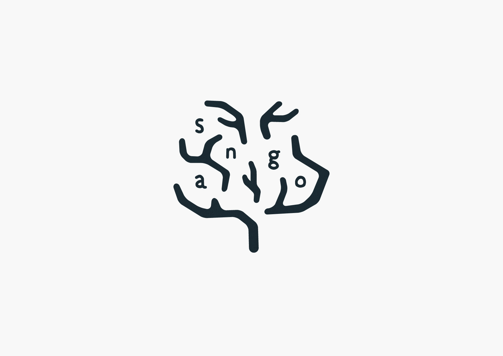
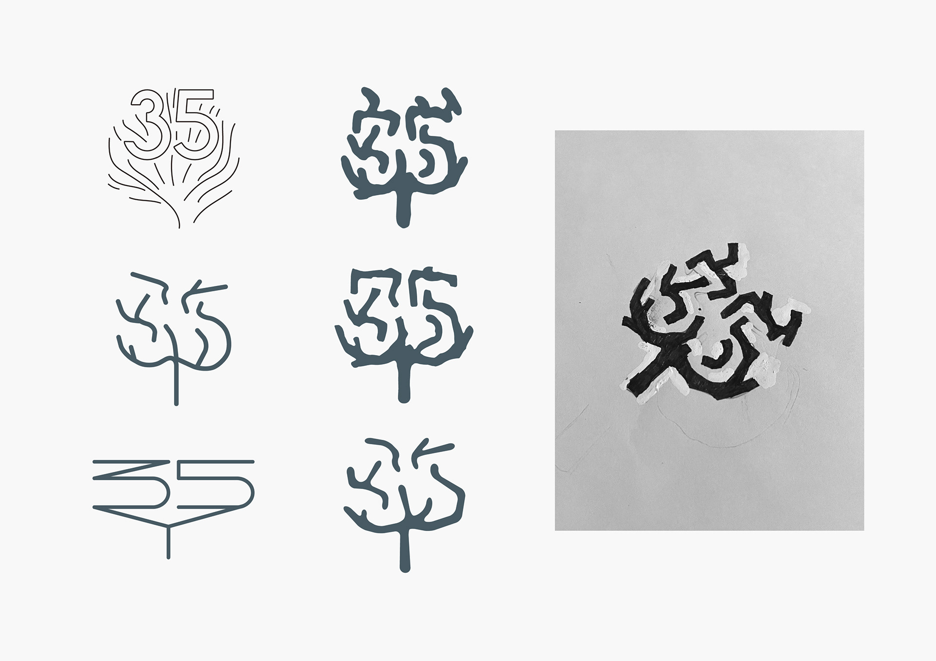
ロゴは温もりにこだわりたかったので、手書きベースで制作しました。
35という数字をわかりやすく、わかりにくくするバランスを探しました。
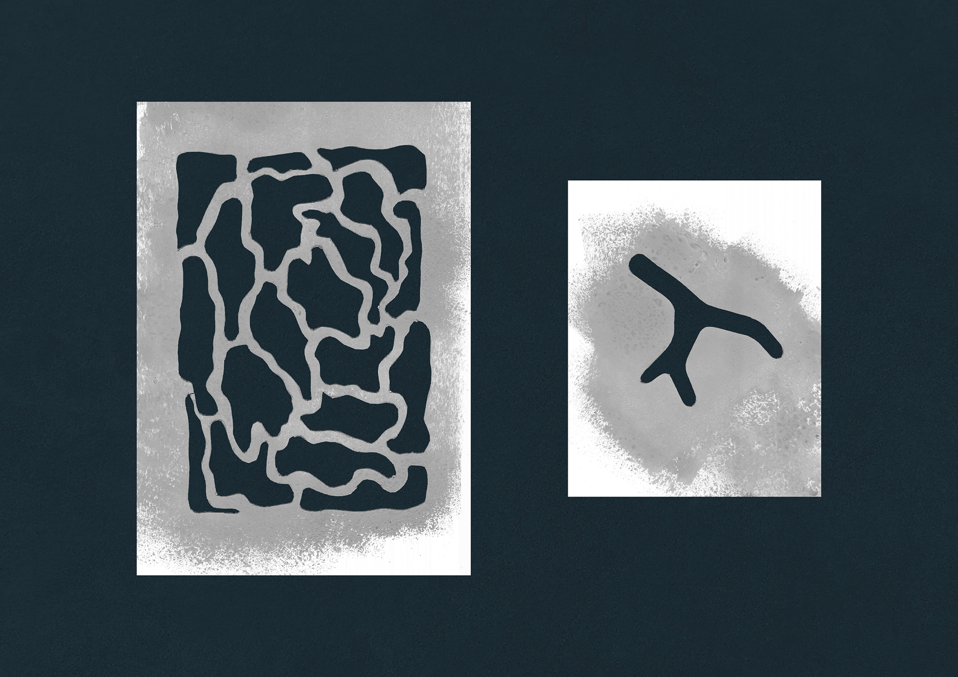
キービジュアルのパーツはスタンピング技法を施した素材を使って、デジタルとアナログが良いバランスになるように表現しました。
35という数字をわかりやすく、わかりにくくするバランスを探しました。
キービジュアルのパーツはスタンピング技法を施した素材を使って、デジタルとアナログが良いバランスになるように表現しました。
I wanted to stick to the warmth of the logo, so I created it based on handwriting.
And I explored a balance between making the number 35 easy to understand and hard to understand.
The parts of the key visual are expressed in a good balance of digital and analog using stamping techniques.
And I explored a balance between making the number 35 easy to understand and hard to understand.
The parts of the key visual are expressed in a good balance of digital and analog using stamping techniques.
Cl : 35(sango)
AD, D : Takuma Tahara
--------------------
Check out our latest project :Instagram
Thank you for watching.
AD, D : Takuma Tahara
--------------------
Check out our latest project :Instagram
Thank you for watching.