
Corporate Identity Design
Logo Design / Business Card / Envelopes
Logo
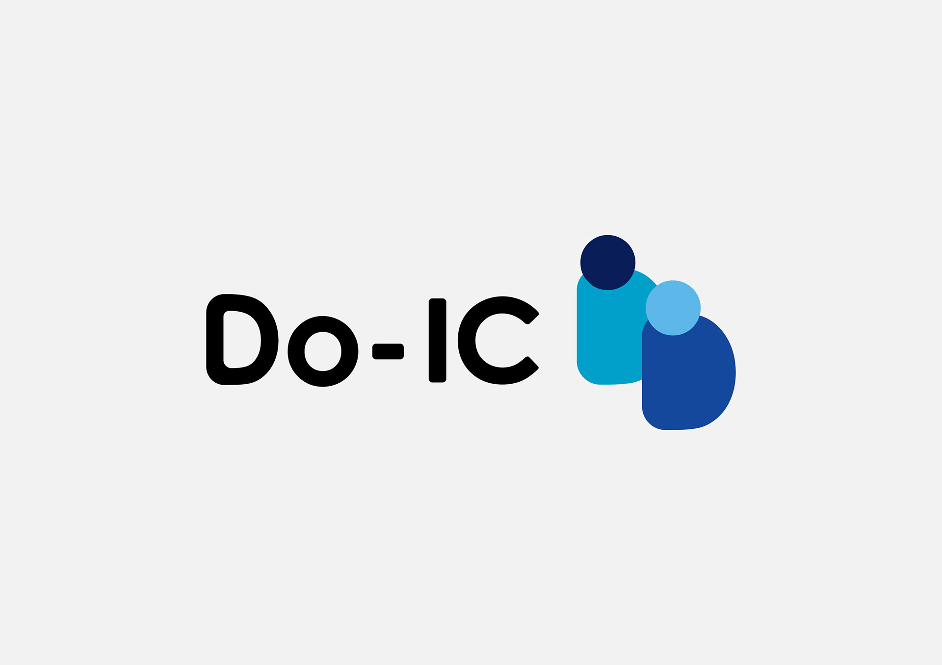
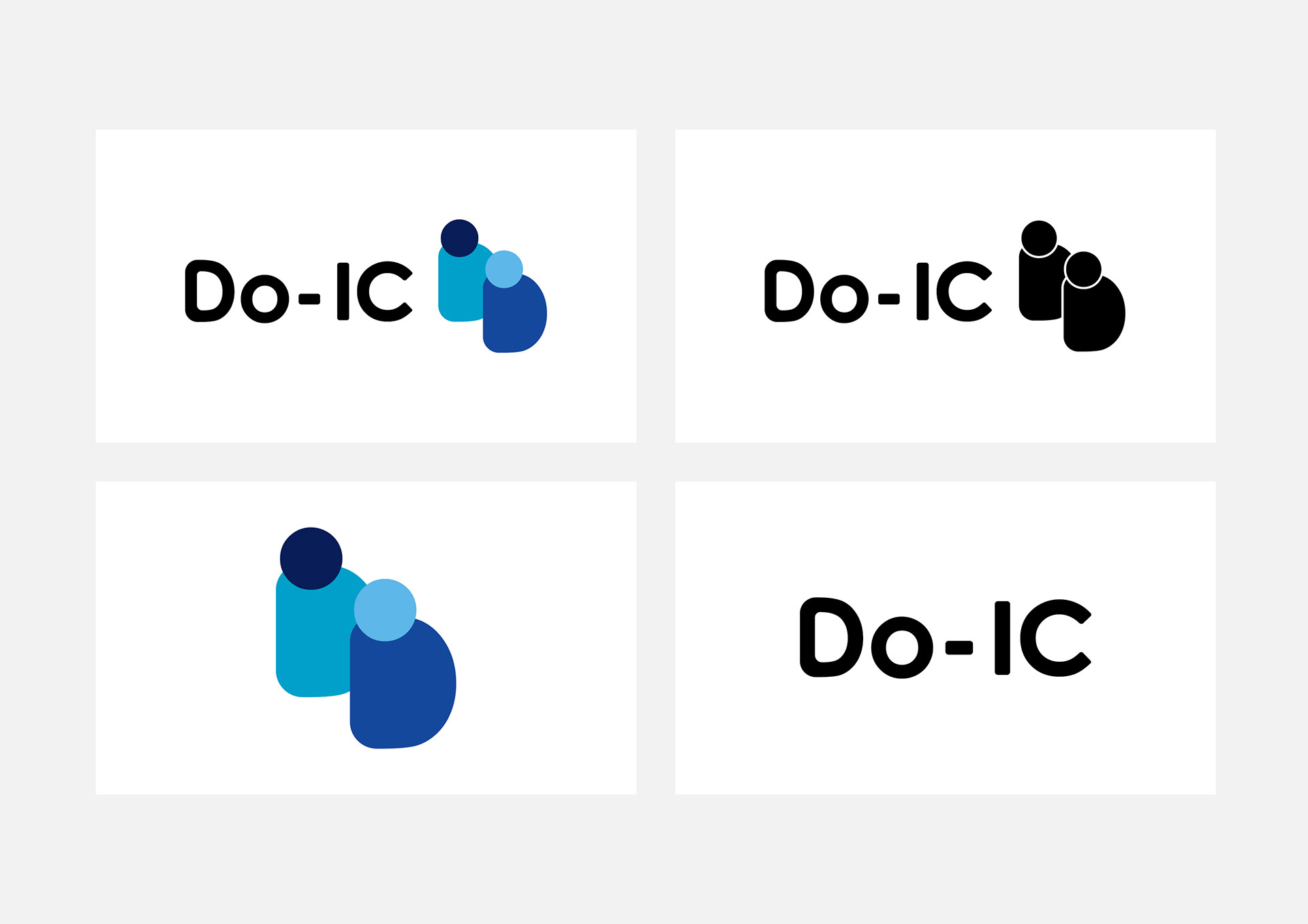
頭文字の「D」と「O」を組み合わせ、2人の人が向き合って「対話」している様子を表現。人と人がつながり、アイデアを組み立てていくDo-ICの姿勢を、無駄のないフラットなデザインに落とし込みました。丸みを帯びた親しみやすいロゴタイプで、クリエイティブパートナーとしての信頼性と、アプローチしやすい温かな人柄を両立させています。
頭文字の「D」と「O」を組み合わせ、2人の人が向き合って「対話」している様子を表現。人と人がつながり、アイデアを組み立てていくDo-ICの姿勢を、無駄のないフラットなデザインに落とし込みました。丸みを帯びた親しみやすいロゴタイプで、クリエイティブパートナーとしての信頼性と、アプローチしやすい温かな人柄を両立させています。
Business Card
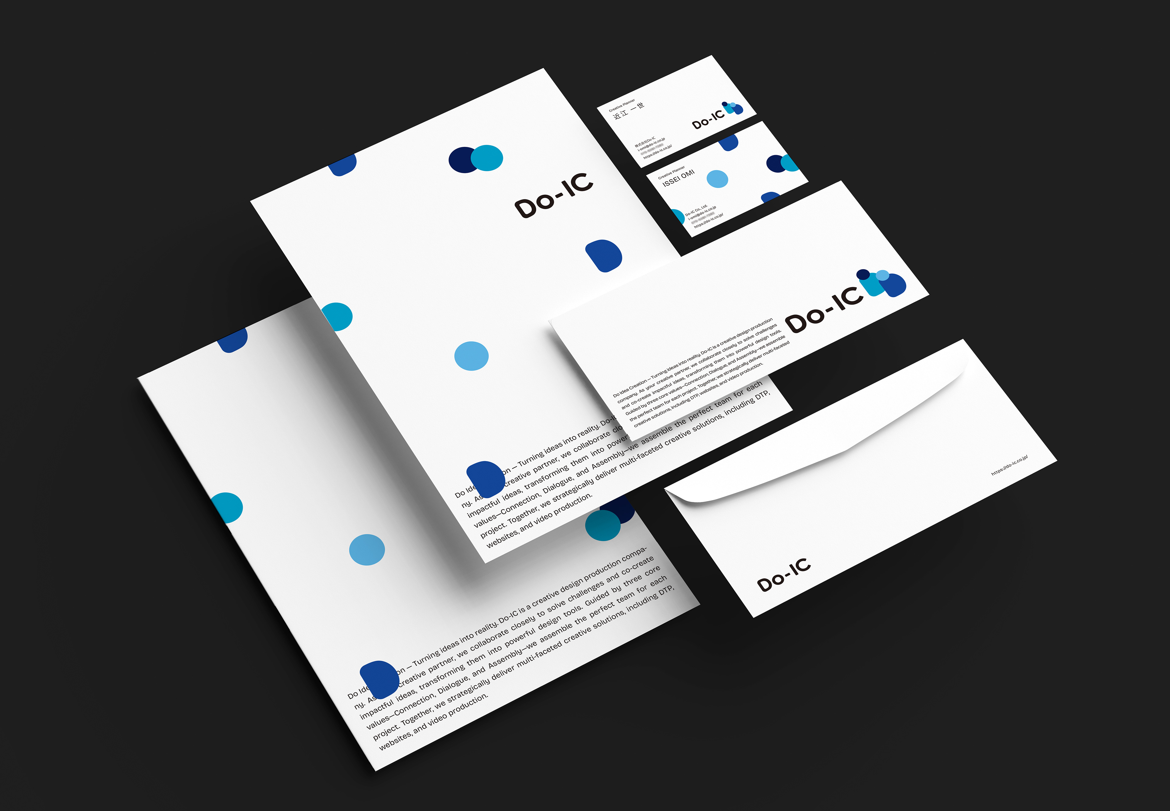
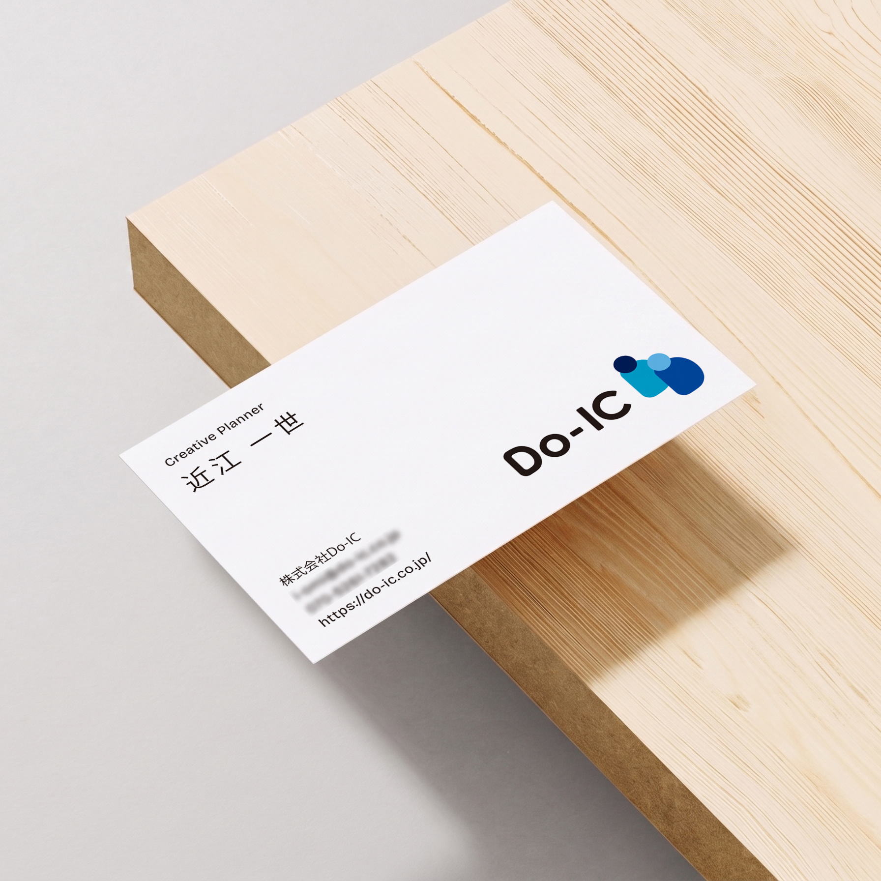
ロゴを構成する「D」と「人」のモチーフを一度解体し、裏面にレイアウト。名刺を繋ぎ合わせることでパーツが再び結びつき、無限に広がる美しいパターンを形成する設計です。バラバラのアイデアやチームのピースをパズルのように組み合わせ、多角的なアウトプットを生み出していく「組み立て」のプロセスを表現しています。
ロゴを構成する「D」と「人」のモチーフを一度解体し、裏面にレイアウト。名刺を繋ぎ合わせることでパーツが再び結びつき、無限に広がる美しいパターンを形成する設計です。バラバラのアイデアやチームのピースをパズルのように組み合わせ、多角的なアウトプットを生み出していく「組み立て」のプロセスを表現しています。
Logo
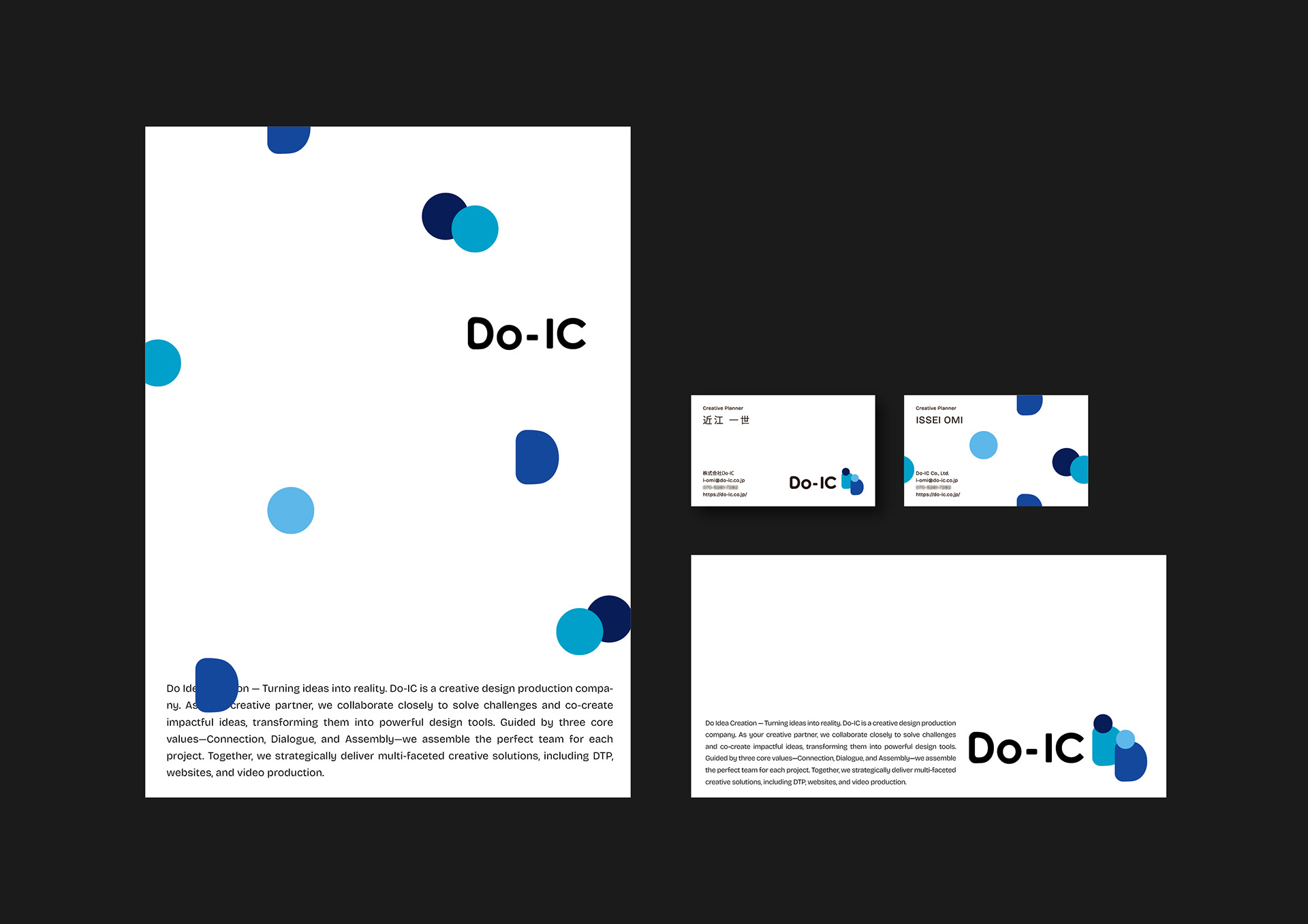
A minimalist flat logo combining the initials "D" and "O" to resemble two people facing each other in conversation. It embodies Do-IC’s core philosophy: connecting people and assembling ideas. The rounded corporate logotype balances professional reliability with an approachable, warm personality.
A minimalist flat logo combining the initials "D" and "O" to resemble two people facing each other in conversation. It embodies Do-IC’s core philosophy: connecting people and assembling ideas. The rounded corporate logotype balances professional reliability with an approachable, warm personality.
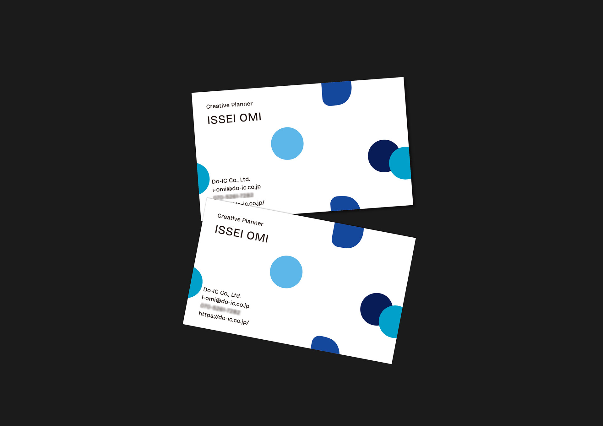
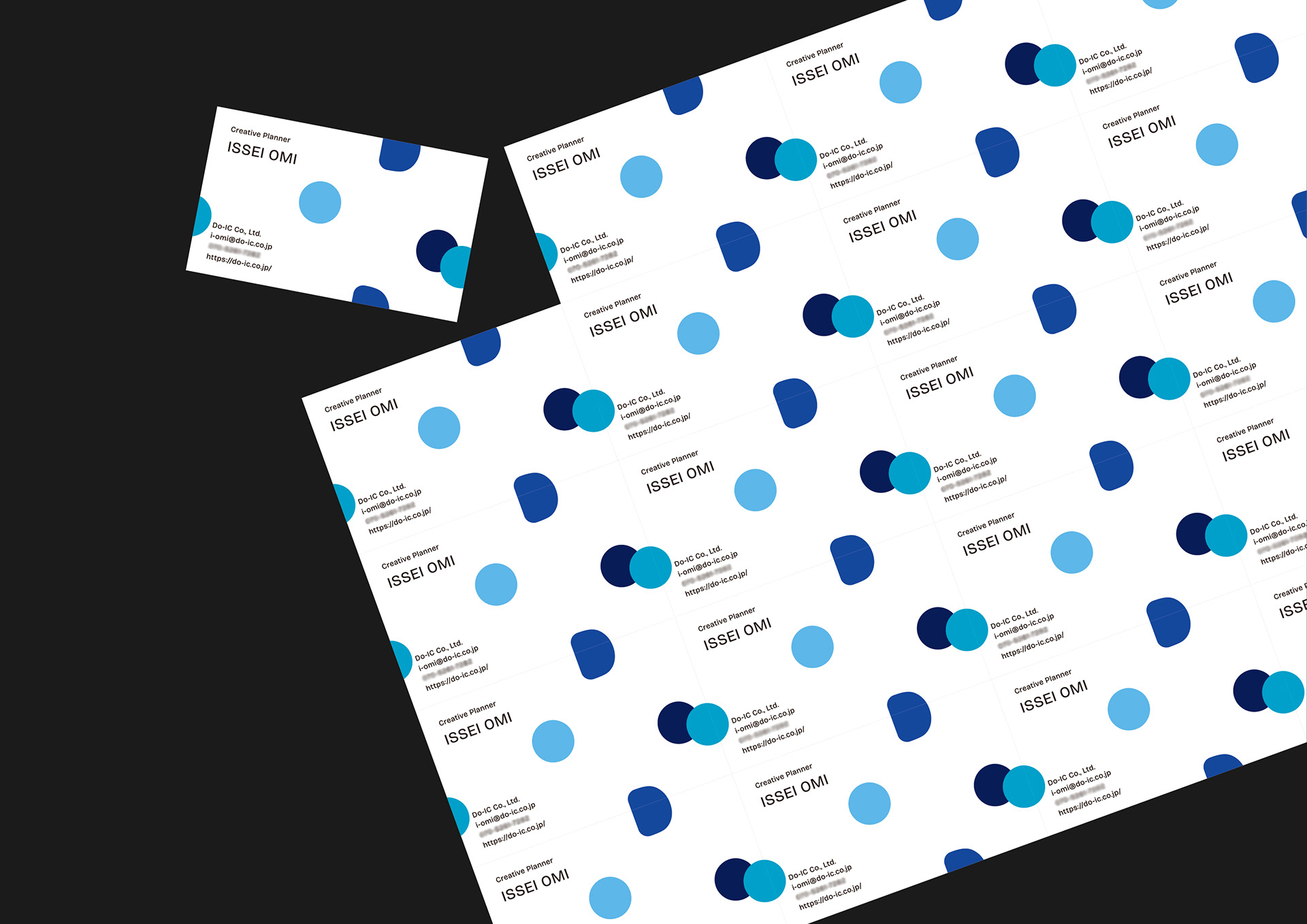
Business Card
The "D" and "human" motifs from the logo are deconstructed and rearranged on the back of the card. When aligned together, these individual cards connect to form an infinite, beautiful pattern. This design reflects Do-IC’s creative process—like a puzzle, combining diverse ideas and the perfect team pieces to generate multifaceted outputs.
Client : Do-IC Co., Ltd.
Graphic Design : TAKUMA TAHARA
--------------------
Check out my latest project:Instagram
Thank you for watching
Graphic Design : TAKUMA TAHARA
--------------------
Check out my latest project:Instagram
Thank you for watching